Project Name
This is going to be called The Foodprint Guide. It’s straightforward and sounds less intimidating than ‘calculator.’ “Guide” invokes a friendly but educational feeling. Looking at the competing works, this is needed.
Project Justification
There is a lack of climate/lifestyle calculators that offer realtime input of variables with realtime output of results. While they all do the job, they only tell you how you’re doing and don’t let you learn by experimentation.
Project Aims
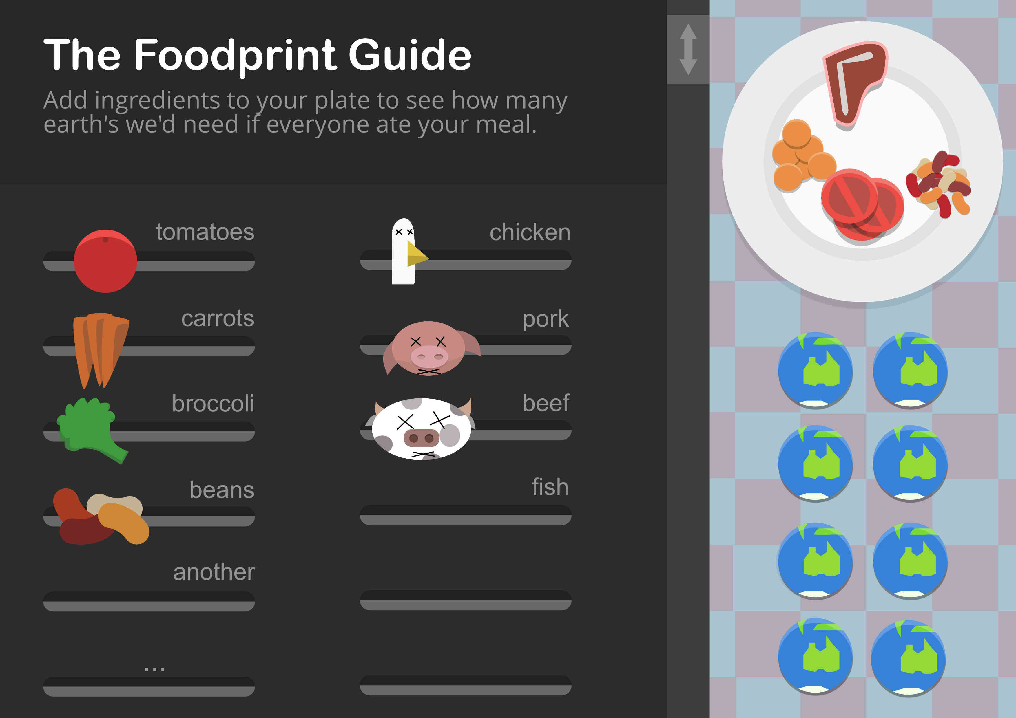
This will be a simple interface with a few sliders which allow people to experiment with one plate of food. The results will be symbolic more than exact and will allow people instant recognition of what foods affect sustainability the most.
As such it will be completely different. It won’t take the serious concentration involved in completing a survey and recalling what you eat (I found this harder than expected). Yet it will teach you immediately what foods do.
It will also not judge. We all suck for the climate, it’s a matter of degree. The Foodprint Guide, In not reflecting on our actual food habits, and working in hypotheticals, allows the user to participate impersonally – yet take away knowledge that will empower them to understand the choices regarding food.
Stakeholders
I would like this interface to be usable by anyone. I don’t believe adults really want to put the effort into using things “designed for adults.” It will be a casual affair.
The concept will revolve around what food goes on a plate – so this is a western bias culturally. However all it’s really showing is a bunch of ingredients, so the learning will be just as evident for anyone. So there will be little informational bias as we all eat similar food.
I’ll present it in neutral, but flat and bright aesthetics. These new stylings are useful because kids appreciate colour, young adults appreciate the kitschiness, and older people appreciate the hat-tip to retro graphical style.
Wireframes
There will be no screen to screen progression in this app. The beauty of this learning tool will be constant experimental interaction with a set of on-screen variables.
On the first sketch of the interface, I encountered many things that needed to be refined (of course). I also realised I need to account for food miles along with food types.

After this sketch, I realised that it needs to be simplified a fair bit. It needed to be more self explanatory. Here’s a second try.

Finally, before getting into more detail with a mockup – I realised I needed to fine tune and explain the interaction. Everything happens on one page, and there is no ‘end’ or ‘result’ (to encourage experimentation), but nonetheless, here’s a simple storyboard showing the workings in detail.

I did though forget to include the “foodmiles” slider in the mockups. It will be another slider but in a larger scale, perhaps above all the others to indicate its significance.
UI Design Mockup